To denote; this image shows a puppet like
face, which may suggests something scary is going to happen within the film
that is being advertised, the person on the poster has one eye that is red and
the other you cannot see, he has a swirl on his cheek, the title has been
scratched, and connects to the two fingers next to it because they could have
been scratching to escape.
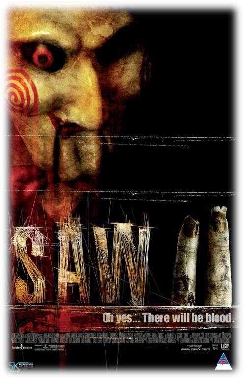 I have connoted that the key image is of
the main protagonist, which is a scary dummy like figure because of the old
plastic look, it is a close up high angle shot to show his features more
clearly, his face a rusty yellow with a swirl of blood on his cheek , maybe to
give the idea of never ending violence, as the swirl just carries on going
round and round, and an abnormal eye with the deep colour of red, representing
anger, his expression evil and angry, this gives the audience the impression
that he is dangerous and is a sign of warning that the film may be scary, I
think this because the red eye could signify violence, in the poster the
picture is the enigma, the production company (twisted pictures) has used
low-key ambient lighting, which is a spot lighting to the side of the face and
used a dark screen/sheet behind to make the background and surrounding area
around the object black/dark , this makes the face fade into the background , I
think this creates an effect that makes the audience wonder what is next to the
‘face’ or what is happening behind it, this may suggest something mysterious.
I have connoted that the key image is of
the main protagonist, which is a scary dummy like figure because of the old
plastic look, it is a close up high angle shot to show his features more
clearly, his face a rusty yellow with a swirl of blood on his cheek , maybe to
give the idea of never ending violence, as the swirl just carries on going
round and round, and an abnormal eye with the deep colour of red, representing
anger, his expression evil and angry, this gives the audience the impression
that he is dangerous and is a sign of warning that the film may be scary, I
think this because the red eye could signify violence, in the poster the
picture is the enigma, the production company (twisted pictures) has used
low-key ambient lighting, which is a spot lighting to the side of the face and
used a dark screen/sheet behind to make the background and surrounding area
around the object black/dark , this makes the face fade into the background , I
think this creates an effect that makes the audience wonder what is next to the
‘face’ or what is happening behind it, this may suggest something mysterious.
The tagline “Oh…There
will be blood.” suggests
it will be a violent film and suggests it is within the horror genre and
something bad is going to happen, it also shows what is in the film, and shows
what everybody expects to see in a horror, which will make them want to see it
even more, if they like horror films, (which is also known as ‘body genre’), I
think this because the audience who are most likely to go and watch the film
will have expectations that the film should meet, for them to enjoy it, and
want to see the next films that follow it up if there is any, so the use of the
word “blood” reassures people the film will be violent/dramatic and will fulfil
their expectations of a good horror film.The title “Saw ll” has been shown as scratchesto
create the lettering with two fingers positioned beside it, that look dirty and
old with broken finger nails, which suggests someone/somethinghas been
scratching to get out of a trap that they have been put in, it makes it seem
like the person has ran out of energy to grab for objects to help get out of
whatever they are stuck in, possibly a grave, which may suggest where the mud
has come from, if you look closely at the bottom of the fingers, they look as
if they have been cut off of the hand, but its not a straight cut, this may
suggest another connection to the title “saw” and the fingers, for example,
maybe the fingers have been cut off by a saw. The title “saw” can also be
linked to another word “sore”, which shows a sign of pain and which yet again
links back to there being violence in the film.
The target audience is recommended for 18
years of age and above and not below, the majority of the audience would
probably be boys because they are the main audience for playing games for
computers and consoles, and play violent games, which involves blood and
weapons and because they play these kind of games they would possibly be into
this type of film, whereas girls are not seen as much playing them type of
games, the film is under the genre horror, and the genre is used to help people
choose what kind of films they like and can relate to what is in the category. The
chromatics
are all co-ordinated with the red, yellow and black theme which keeps the
poster together. It has low-key ambient lighting and it creates a dark effect
around the face used on the poster, the face fades into the darkness and shows
shadows on the face and makes it look more spooky. The old creases in the
poster makes it look old, which gives it the stereotypical horror look. The Saw
ll poster is a representation of the horror genre.
I would expect this poster to be shown in
cinema’s and on billboards/places that are common for advertising, this is so
people of that age rating ,know that it is on in the cinema’s or has been
released on DVD and if they like the genre of film then they can decide whether
they would like to see it, because it’s in the genre that may interest them.
Twisted pictures (production company)
connotes the images they have used, which are twisted and grotesque, this helps
give the idea of what the film is like, this may help people make the decision
whether they would be able to watch the film or not.
No comments:
Post a Comment