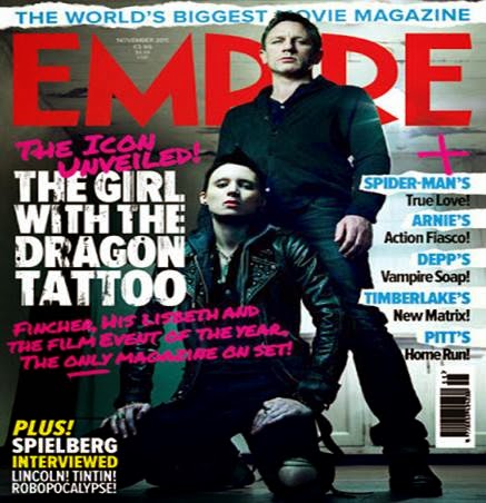
 The tagline is positioned above the
title of the magazine and gives connotations that the audience can’t make a
mistake buying this magazine. It also discredits all it’s competition by saying
it is the ‘biggest’ and people usually link this with being the best movie
magazine.
The title gives the connotations of
strength and that the magazine is wide spread. It also sets it up to be the
best film magazine. The red font makes it stand out and usually creates a
contrast between the main image and the title. It is also slightly obstructed
by the main image, but because the magazine has a good reputation it doesn’t
matter because people know what it is called.
The key image of this magazine is a
two-shot of the actors from the featured film , which is shown by the large bold
font of the main strapline. They are both wearing black which connotes danger,
mystery and possibly even evil. It is used as the main selling point of the
magazine and gives the audience an insight to what will the feature article
will be like inside. Challenging the conventions of a magazine there are no secondary
images and the effect of this is to make the audience focus more on the main
image.
The straplines are used to show
what else is in the magazine and shows the audience the large amount of
content. The main strapline is shown by being a larger font than the others. It
also connects with the gothic street vibe which is also portrayed within the
key image.
The dress codes used within the
main image are dark and gothic but also quite smart giving the impression of sophistication as
well as danger. This however, represents the film being featured rather than
the magazine itself.
Empire being a film magazine, do
not usually show representations of the magazine but however the film being
featured, so the film being represented in this magazine is ‘The girl with the
dragon tattoo”. It shows the film to dark and gothic and rather alternative.
No comments:
Post a Comment